

A paper card can be perfectly designed and still disappear into a pants pocket graveyard.
A metal card doesn’t, it stands out.
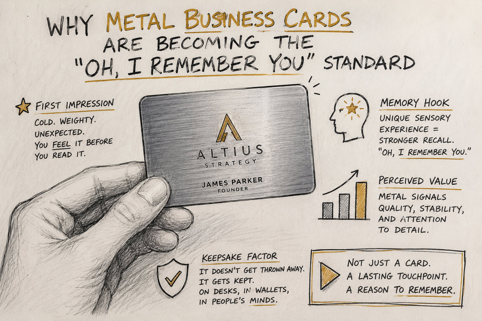
It lands with weight, temperature, and that tiny moment of “wait… what is this?” before anyone even reads your name. That pause is what it’s all about. You’re buying extra-seconds of attention and a longer shelf life in someone’s mind.
Metal cards aren’t for everyone (and that’s kind of the point)
Now, this won’t apply to everyone, but if you hand out 2000 cards at a trade show and your success metric is “volume,” metal might be the wrong tool. It’s not built for spraying and praying, except by the rare few (celebrities at an event perhaps are an exception).
Where metal wins is when the interaction itself matters: smaller counts, higher stakes, a reason to be remembered.
I’ve seen metal business cards work absurdly well for people in roles where trust is the product, advisors, founders, real estate, partnership leads, consultants. The card acts like a credibility shortcut. Not proof, obviously. But a strong signal.
The real mechanism: tactile credibility
Look, humans judge materials. Fast. Without permission. A heavy object reads as “valuable” in our brains long before we rationalize it.
There’s a classic result in consumer psychology called the haptic weight bias: heavier items are often perceived as higher quality or more serious. One frequently cited paper is by Ackerman, Nocera, and Bargh (2010) in Science, which showed physical weight can influence judgments of importance and seriousness. That’s not “metal cards research” specifically, but it maps cleanly to why these cards change the tone of an interaction.
If you’re going to spend money on a first impression, at least spend it on something your recipient can literally feel.
Hot take: most “premium” cards are actually trying too hard
A metal card can look expensive and still feel tacky if you treat it like a trophy.
The best ones don’t scream. They behave like quality: clean typography, disciplined spacing, sharp edges that don’t snag fabric, and a finish that doesn’t look like it came off a novelty keychain. If you wouldn’t wear the pattern on a suit, don’t engrave it onto metal.
And please, skip the “motivational quote on the back.” You’re not a fortune cookie.
Do metal business cards fit your use case?
Ask yourself this (quickly, honestly):
- Do my meetings have high lifetime value per relationship?
- Do I rely on trust or perceived competence early in the conversation?
- Will I hand cards out in controlled moments (not mass distribution)?
- Can my brand carry “premium” without feeling like cosplay?
- Do I have a follow-up system that makes the card more than a souvenir?
If you answered “no” to the last one, fix that first. A memorable card with sloppy follow-up is like a great book cover stapled to blank pages.
When metal beats traditional cards: the ROI logic (not the fantasy)
People love claiming metal “shortens sales cycles.” Sometimes it does. Often it just increases the odds you get the next interaction.
Here’s how ROI usually shows up in the real world:
1) Higher retention. Paper gets tossed. Metal gets kept.
2) Better recall. They remember you, not just your company name.
3) Cleaner follow-up. A QR code can route them somewhere useful instead of “call me sometime.”
And the less obvious one:
One metal card can get passed around a room. Paper rarely earns that privilege.
QR codes: good when they’re useful, bad when they’re the whole personality
Digital integration is where metal cards go from “nice flex” to operational tool.
Use a QR code to send someone to:
- a vCard/contact save page
- a calendar booking link
- a portfolio landing page personalized to the event
- a short demo video that doesn’t waste their time
Don’t send them to your homepage. That’s the digital equivalent of handing someone a brochure rack.
Also: test QR scannability across different phone cameras and lighting conditions before committing to a design.
Design options that actually matter (finishes, weight, personalization)
Finishes & textures: where perception gets built
Brushed and matte finishes tend to read “executive.” Polished can look incredible, but it’s fingerprint city. A brushed finish is a solid middle ground that holds up well with daily handling.
Texture isn’t decoration; it’s grip and vibe. A subtle texture also hides micro-scratches better over time, which matters because durability is part of the promise you’re making.
A trick I like: keep the logo treatment restrained, then use texture to create the “premium” moment. People discover it with their fingertips.
Weight & feel: don’t overdo it
Heavier feels premium, until it becomes annoying. If a card pulls down a wallet or feels like a guitar pick made of steel, it won’t stay in circulation. Portability is underrated.
Generally credit card thickness is preferred, and feels just like the most premium cards executives are already carrying.
Personalization: engraving beats printing for longevity
Laser engraving generally ages better than surface printing. Names and titles should stay readable after months of handling. If your card looks worn after three weeks, it stops being “premium” and starts being “cheap in an expensive way.”
Materials, cost, and timelines (the specialist briefing part)
Material choice changes everything: machining time, finishing complexity, and lead times.
- Aluminum: lighter, cost-effective, fast production, can bend easily.
- Stainless steel: durable, heavier, strong “serious” signal, longer finishing time
- Brass: warm tone, distinctive, develops character over time with use
Production timelines usually stretch when you add:
- multi-step coloring (anodizing, plating)
- full-coverage coatings
- complicated cut-outs or custom edges
- heavy personalization across large batches
If you need them for an event date, reverse-engineer it. Design approval delays are the silent killer here, not machining.
A practical workflow: from quote to handoff (so it doesn’t get messy)
You want predictability? Treat it like a mini manufacturing project, not a design whim.
- Quote phase: lock substrate, thickness, finish, quantity, personalization method
- Production brief: define tolerances (edge, finish consistency, legibility), packaging, deadlines
- Proofing: review contrast, scannability (QR), and brand alignment
- Pilot batch: small run to validate feel and real-world readability
- Full production: monitor batch consistency
- Distribution: who gets them, when, and what follow-up workflow is attached
That last part, distribution, separates grown-up programs from “cool idea” experiments.
Real-world outcomes: what “working” actually looks like
The best stories aren’t “people loved my card.” That’s vanity.
The useful outcomes sound like:
- “I got two unsolicited follow-ups because they kept it on their desk.”
- “My card got passed to a decision-maker I didn’t meet.”
- “The QR link drove calendar bookings from the event list.”
- “Prospects referenced the card weeks later, unprompted.”
Memorability is only valuable when it creates motion.
Sustainability: don’t greenwash your way into distrust
Eco-friendly claims can backfire if they’re vague. Metal is durable and often recyclable, yes, but the sourcing, coatings, and packaging matter.
If sustainability is part of your brand message, ask suppliers direct questions:
- Is the metal recycled content? How much?
- Are coatings recyclable-compatible or do they complicate processing?
- What’s the packaging made from?
- Can they provide sourcing documentation?
If the supplier gets slippery, that’s your answer.
Common pitfalls (the ones I see repeatedly)
Overhyping the prestige. People can smell insecurity through brushed steel.
Over-designing. If it looks like a nightclub VIP pass, it’ll be treated like one.
Forgetting the follow-up workflow. A premium object doesn’t fix a weak process.
Going too heavy or too thick. If it’s annoying to carry, it won’t get carried.
Using a QR code as a gimmick. Make it useful or don’t bother.
Quick-start checklist (small, usable, no fluff)
- Pick one goal: recall, bookings, portfolio views, or warm intros
- Choose a finish that matches your brand’s “tone” (matte/brushed is the safe bet)
- Decide your distribution rule (who gets metal vs standard)
- Build a landing page that does one thing well
- Test QR scannability in bad lighting and at an angle
- Pilot 25, 50, 100 cards before ordering a big run
- Track something measurable: scans, saves, bookings, replies
A metal business card is a physical promise. Make sure the rest of your brand keeps it.