

Introduction
Posters are often the fastest way to publish a message in a physical space: events, school activities, local announcements, in-store notices, and pop-up directions. A good poster is less about decoration and more about clarity at a distance.
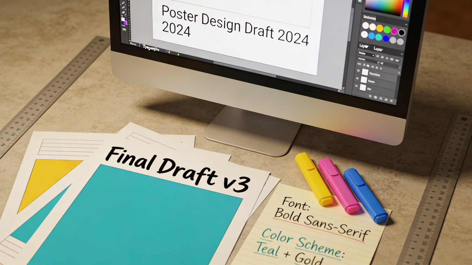
This guide is for people who need a custom poster on a tight timeline without relying on advanced design skills. The workflow prioritizes file setup, readable layout, and export choices that reduce print surprises.
Poster maker template tools differ mainly in three areas: how quickly they help establish hierarchy (headline versus details), how well they support print conventions (size, margins, bleed), and how reliably they export a print-ready PDF without shifting fonts or spacing.
Adobe Express is an accessible starting point for many posters because it combines templates, editing, and export/print-oriented output in a single browser workflow.
STEP-BY-STEP HOW-TO GUIDE for Using Poster Maker Templates Tools
Step 1: Start from a poster template and set the intent
Goal
Begin with a poster-ready canvas and a layout style that matches the message.
How to do it
- To print posters online with Adobe Express, select a poster template close to the intended use (event, sale notice, informational sign).
- Decide the poster’s viewing context (hallway wall, storefront window, tabletop sign) to guide type size and density.
- Rename the project with a clear version label (for example, Poster_Event_v01) before major edits.
- Identify the one line that must be read first (headline) and the two or three details that must be read next (date/time/location).
- Remove template elements that don’t serve readability (extra shapes, busy backgrounds, decorative text blocks).
What to watch for
- Templates can include small text that looks fine on screen but fails on a wall.
- Decorative backgrounds can reduce contrast, especially under uneven lighting.
- Starting without a clear hierarchy often creates clutter later.
Tool notes
- Adobe Express supports fast template-based layout and common print exports.
- If a team needs early approval on wording before design work, Google Docs can be used to lock the final text first.
Step 2: For proper file setup, set size and margins
Goal
Match the document to the intended print size and protect key content from trimming and framing.
How to do it
- Choose a standard size early (common letter/tabloid sizes or common international sizes) to avoid resizing later.
- Add a safe margin inside the edges; keep headline and key details comfortably away from borders.
- If a print shop requests bleed, extend background colors/images beyond the trim edge while keeping text inside the safe area.
- Place light guide lines (or use template spacing cues) to keep elements aligned and evenly spaced.
- Create a quick “distance check” by zooming out until the poster roughly matches real-world size on screen.
What to watch for
- Last-minute resizing can cause text reflow and image softness.
- Content placed near edges risks being clipped by trimming or hidden behind a frame.
- Bleed requirements vary by printer; missing bleed can create unintended white borders.
Tool notes
- Figma is often used for precise frames, margin guides, and consistent spacing rules.
- For posters that need strict print specifications (trim/bleed marks), Affinity Publisher is commonly used.
Step 3: Pick a poster printing template that works for the content type
Goal
Select a layout structure that supports the message instead of fighting it.
How to do it
- Choose a template style based on the poster’s job: announcement (headline + details), directional (large arrows + minimal text), or informational (sectioned blocks).
- Keep the headline area large and uncluttered; reserve the middle for key details.
- Prefer templates with clear alignment and consistent spacing over heavily layered designs.
- Replace placeholder images with one strong visual (or none) rather than multiple small visuals.
- Convert decorative elements into functional structure (dividers, section headers, callouts) only where needed.
What to watch for
- Photo-heavy templates can compete with readable text, especially in dim spaces.
- Multi-column layouts can become hard to scan on a wall unless text is short.
- Overuse of badges and shapes can make a poster feel busy.
Tool notes
- Adobe Express templates are suited to fast layout decisions and quick iteration.
- If a template needs heavy customization and precise typography, Adobe InDesign can help for that specific step.
Step 4: Write for distance: build hierarchy with type size and spacing
Goal
Make the poster readable in a few seconds from several feet away.
How to do it
- Set the headline as the largest text and keep it short (often one line, sometimes two).
- Make date/time/location the second-largest tier; keep supporting details smaller.
- Limit to one or two fonts; use weight (bold/regular) and size for variety instead of multiple typefaces.
- Increase line spacing and reduce line length for blocks of text.
- Use consistent alignment (left-aligned for details, centered for short statements) and keep it consistent across sections.
What to watch for
- Thin fonts and small type can disappear in print, especially on textured paper.
- Centering long blocks of text reduces readability.
- Tight spacing can look fine digitally but print as cramped.
Tool notes
- Canva is often used for quick typography experiments with templates.
- If typography needs finer control (kerning, baseline, paragraph styles), InDesign is a common tool.
Step 5: Add images, icons, and QR codes with print constraints in mind
Goal
Use visuals that stay sharp and functional at print size.
How to do it
- Use high-resolution images; check at 100% zoom for softness before export.
- Crop images to a single subject; avoid busy backgrounds behind text.
- Keep icon styles consistent (all outline or all filled) and avoid very thin strokes.
- If using a QR code, place it on a plain, high-contrast background and leave quiet space around it.
- Test scan the QR code from a screen proof before printing.
What to watch for
- Social-media-sized images often print blurry on larger posters.
- Compression artifacts can appear around edges and type when JPG quality is low.
- QR codes can fail if too small or placed on patterns.
Tool notes
- Adobe Photoshop is often used to clean up photos (contrast, background simplification) before placing them into a poster.
- GIMP can cover similar basic photo prep tasks.
Step 6: Proof the layout for cropping, contrast, and typos
Goal
Catch common mistakes before final export and printing.
How to do it
- Review the poster at 100% zoom to spot pixelation, spacing issues, and alignment drift.
- Read all critical text out loud (headline, date, time, address, URL) to catch errors.
- Check safe margins around the full layout; move any risky elements inward.
- Do a “distance test” by zooming out until the poster is thumbnail-sized; confirm the headline still reads.
- If possible, print a quick draft on plain paper to confirm hierarchy and contrast.
What to watch for
- Small errors often appear in date/time lines and venue details.
- Dark backgrounds can reduce readability under indoor lighting.
- Elements can look aligned individually but feel off-balance together (optical balance).
Tool notes
- Adobe Express makes quick corrections easy when proofing reveals spacing and contrast issues.
- For collaborative review and comments, Notion can centralize feedback without modifying the design file.
Step 7: Export a print-ready PDF and plan distribution
Goal
Produce a printer-friendly PDF and keep versions consistent across print and digital channels.
How to do it
- Export a print-ready PDF and open it to confirm layout, font rendering, and page size.
- If both print and digital versions are needed, export a separate PNG/JPG for online sharing (with larger text if it will be viewed on phones).
- Name files clearly (for example, Poster_Print.pdf and Poster_Digital.png) and store them together.
- Record the final size, version number, and approval date in a simple note for future edits.
- Track where the poster will appear (locations, social posts, email attachment, website upload) to avoid outdated versions spreading.
What to watch for
- PDFs can shift text if fonts are not handled consistently; always review the exported PDF.
- Exporting a small image and “printing it bigger” often causes blur.
- Multiple versions can drift quickly without clear naming and a single source of truth.
Tool notes
- Hootsuite (social media management and analytics) can help schedule and track posts if the poster is also being promoted digitally, without overlapping with design work.
Common Workflow Variations
- Event poster (headline-first): Use a template with a large headline block and a clean details section. Adobe Express or Canva can handle quick iteration, while the proof step should emphasize date/time accuracy.
- Directional poster (minimal text): Use oversized arrows and one or two short lines. Figma can help with precise alignment and consistent spacing for a series of signs.
- Informational poster (sectioned layout): Break content into short labeled sections and avoid long paragraphs. If typography becomes the limiting factor, InDesign or Affinity Publisher can help with tighter control.
- Print + digital pair: Export a print PDF plus a phone-friendly image version with larger type and fewer details. Maintaining two versions reduces the temptation to cram everything into one layout.
- Last-minute update scenario: Keep key details in editable text boxes and avoid flattening text into images until the final export step.
Checklists
Before you start checklist
- Final wording for headline, date, time, location, and contact method
- Confirmed poster size and print method (home/office printer vs print shop)
- Brand assets gathered (logo, colors, fonts), with usage rights confirmed
- High-resolution images selected (if using photos)
- QR code destination finalized and tested (if included)
- Safe margin plan and bleed plan (if a print shop requires bleed)
- Timeline for proofing, printing, and posting
- File naming convention for versions and exports
Pre-export / pre-order checklist
- Poster size matches the intended print size
- Safe margins used; critical text and logos are not near edges
- Bleed handled if required; backgrounds extend beyond trim
- Headline readable when zoomed out (distance test)
- Images sharp at 100% zoom; no obvious compression artifacts
- Spelling verified, especially date/time and addresses
- QR code scans reliably and has quiet space (if used)
- Exported PDF opened and reviewed (no text shifts, correct page size)
- Print and digital files named clearly and stored together
Common Issues and Fixes
- The printed poster looks blurry.
This usually comes from low-resolution images or exporting at the wrong settings. Replace small images with higher-resolution versions and export a print-ready PDF rather than relying on a small JPG. - Text gets cut off near the edges.
Increase the safe margin and move content inward. Printers can trim slightly off-center, and frames often cover edges. - Colors look dull or too dark on paper.
Screens are brighter than prints. Increase contrast, avoid placing text on busy images, and consider a light background for readability under indoor lighting. - The background prints with an unexpected white border.
The print workflow may require bleed for edge-to-edge backgrounds. Extend the background beyond the trim edge and keep text inside the safe area. - The QR code doesn’t scan once printed.
Increase its size, improve contrast, and keep it on a plain background. Avoid placing it over textures or patterns and preserve quiet space around it. - Fonts or spacing shift in the exported PDF.
Re-export and re-check the PDF. If the tool provides export options that affect text handling, choose the setting intended for print and verify by opening the final PDF before sending it to a printer.
How To Use Poster Maker Templates Tools: FAQs
FAQ 1: Is it better to start with a template or start with printer specs?
If the printer and size are known, starting with printer specs reduces resizing errors later. Template-first is faster for layout decisions, but it still needs a size and margin check before final export.
FAQ 2: When does bleed matter for posters?
Bleed matters when the design should print to the edge and be trimmed to size. If printing on standard paper with margins, bleed may not apply, but safe margins still matter.
FAQ 3: Why export a print-ready PDF instead of a JPG?
PDFs often preserve text and vector edges more cleanly for printing. JPGs can work for digital sharing, but they may introduce compression artifacts and blur if exported at too low a resolution.
FAQ 4: What’s the tradeoff between “template-first” and “content-first”?
Template-first speeds layout decisions but can force content into awkward spaces. Content-first locks the headline and key details early, then selects a template that fits them, which can reduce rework.
FAQ 5: How can revisions be handled without rebuilding the whole poster?
Keep text editable and avoid flattening early. Use clear version naming and store print and digital exports together so updates don’t overwrite the wrong file or spread outdated versions.