

A site can look expensive and still feel sketchy.
That’s the problem web design services deal with every day. Style gets attention. Legitimacy earns the click, the form fill, the purchase, the trust. When those two are out of balance, visitors bounce fast, and they don’t always know why. They just feel it.
For brands in sensitive categories—reputation, privacy, finance, healthcare—this tradeoff is brutal. NetReputation sees it in the real world: people arrive already cautious. If the site feels like a template, a pitch, or a “too-clever” landing page, they assume the worst and move on.
A good design isn’t just pretty. It’s believable.
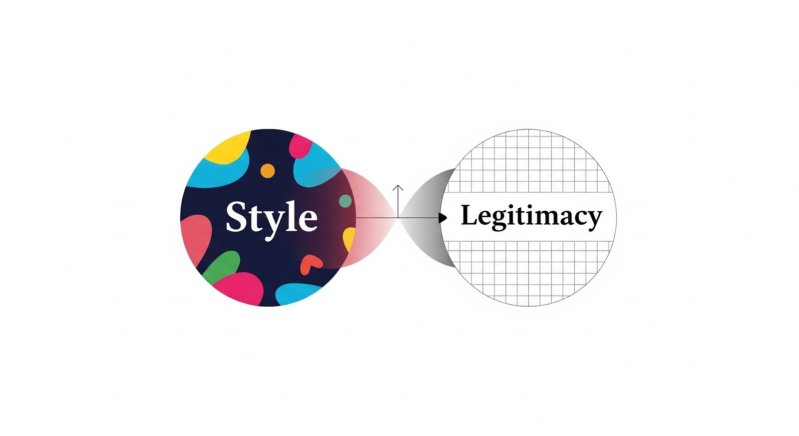
What “Style” Really Means Online
Style is the part everyone notices first. It’s the visual language:
- typography choices
- color and contrast
- layout and spacing
- motion, transitions, micro-interactions
- illustrations, photos, icon sets
- brand voice expressed through UI
Style is what makes a site feel current and intentional. It can signal confidence, quality, and modernity.
But style can also signal the wrong thing. Over-styled pages can feel like ads. Too much animation can feel like a gimmick. Trend-heavy design can age in a year.
Style is not the enemy. Style without restraint is.
What “Legitimacy” Means to a Visitor
Legitimacy isn’t a badge in the footer. It’s the feeling that a real business is behind the site and will still be there tomorrow.
Visitors look for proof, fast. The signals vary by industry, but they tend to fall into a few buckets:
Transparency signals
- clear “About” page with real specifics (not vague mission copy)
- visible phone number, address, or service area
- team names, leadership, credentials when relevant
- policies that look written by humans (privacy, terms, refunds)
Trust signals
- recognizable reviews, testimonials, or case studies
- third-party mentions, partnerships, certifications
- consistent branding across pages (not mismatched fonts and layouts)
Safety signals
- HTTPS and secure form behavior
- consent and privacy controls that don’t feel sneaky
- accessibility basics that show care and competence
Legitimacy is what keeps “interest” from turning into suspicion.
Where Web Design Services Get Stuck Between the Two
Most design failures aren’t dramatic. They’re small choices that stack up.
Style pushes for “wow”
Clients often want:
- heavy motion and scroll effects
- oversized hero sections with minimal copy
- ultra-minimal navigation
- trendy UI patterns that look “premium” on Dribbble
Legitimacy pushes for “proof”
The same client also needs:
- clear service explanations
- reviews and outcomes
- transparent policies
- stable performance on mobile
- forms that feel safe to complete
The tension is real. If designers chase “wow” too hard, the site starts to feel like a product launch page rather than a business. If they chase “proof” too hard, the site can feel dated and corporate.
The job is to make the visitor feel both impressed and safe.
The Hidden Technical Tradeoff: Motion Versus Performance
Animation is the easiest way to create a “premium” feel. It’s also the fastest way to tank performance.
Common style moves that quietly hurt legitimacy:
- large background videos that slow first load
- heavy JavaScript libraries just to animate text
- parallax and scroll-trigger effects that stutter on mid-range phones
- Lottie files and sliders stacked across the page
- oversized hero images that aren’t properly compressed
A slow site doesn’t just lose conversions. It feels unprofessional. People interpret lag as risk.
A clean, fast site with subtle motion reads as confident. A flashy site that struggles to load reads as desperate.
The Design Choices That Accidentally Create “Scam Energy”
Some patterns consistently trigger distrust, even when the business is legitimate.
Web design services have to watch for these:
- too little context above the fold
A giant headline and a button with no explanation feel like a funnel. - aggressive popups and chat triggers
Instant popups feel like pressure, not help. - stock photos that look staged
People can smell them. They lower credibility immediately. - vague claims with no proof
“Trusted by thousands” means nothing without specifics. - over-minimal navigation
If visitors can’t find details, they assume there aren’t any. - forms that ask for too much too soon
The more fields, the more suspicion—especially in reputation and privacy services.
These aren’t “design opinions.” They’re conversion reality.
The Legitimacy Stack That Works Without Killing Style
A site does not need to look boring to feel credible. It needs to show proof in the right places, without clutter.
A strong legitimacy stack usually includes:
- clear positioning (who it’s for, what it solves, how it works)
- visible contact options (not buried)
- reviews or outcomes tied to real scenarios
- an “About” section that feels specific and grounded
- security and privacy cues where data is collected
- consistent UI patterns that don’t shift page to page
The mistake is treating these like “extras.” They’re part of the design.
NetReputation’s space is a good example of why this matters. People don’t browse reputation services for fun. They arrive stressed, skeptical, and ready to judge. If the site feels even slightly off, they don’t fill out the form. They leave.
Where Style Actually Helps Legitimacy
Style can increase trust when it supports clarity.
Design choices that tend to build legitimacy:
- generous spacing and readable typography
- strong information hierarchy (visitors know where to look)
- calm color palettes with intentional contrast
- micro-interactions that confirm actions (form feedback, hover states)
- clean photography that looks real, not staged
- visuals that explain, not decorate (simple diagrams, process steps)
A modern site should feel designed. It just shouldn’t feel like it’s trying too hard.
Practical “Balanced” Patterns That Usually Win
These are reliable hybrid web design services use when the goal is both style and legitimacy.
Hero section that works
- a strong headline
- one-sentence explanation that removes ambiguity
- one clear CTA
- a trust element nearby (review rating, credential, or short proof line)
Social proof that doesn’t feel spammy
- 2–3 short testimonials with context
- one deeper case study link
- real language, not polished slogans
Navigation that supports confidence
- simple top nav with “How it works,” “Reviews,” “About,” “Contact”
- a footer that repeats important trust links (privacy, terms, FAQs)
Motion that feels premium, not heavy
- subtle transitions
- reduced-motion support
- no animation that blocks reading or delays interaction
The Real Tradeoff Isn’t Style vs Legitimacy
It’s style vs clarity.
Visitors forgive a simple design if it’s clear. They don’t forgive confusing design, even if it’s beautiful.
Web design services that perform long-term treatment of legitimacy as a design requirement, not a content problem to patch later. Style sets the mood. Legitimacy earns the action.
If the site looks great but feels questionable, it fails. If it feels trustworthy but looks outdated, it loses attention.
The win is a site that looks modern, loads fast, explains itself quickly, and proves it’s real—without begging for belief.